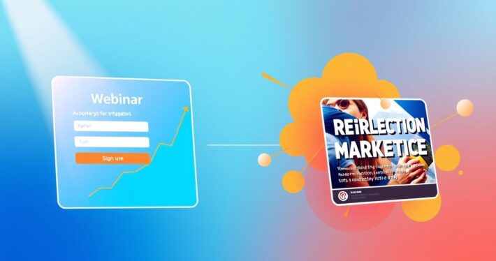
How to Write a High-Converting Webinar Registration Page
How to Write a High-Converting Webinar Registration Page
Creating a high-converting webinar registration page is both an art and a science. It’s where first impressions are made, and potential attendees decide whether your webinar is worth their time. But let’s be honest: not all registration pages are created equal. Some feel like a chore to fill out, while others are so compelling that signing up feels like a no-brainer. So, how do you create the latter? Let’s dive in.
Why Your Webinar Registration Page Matters
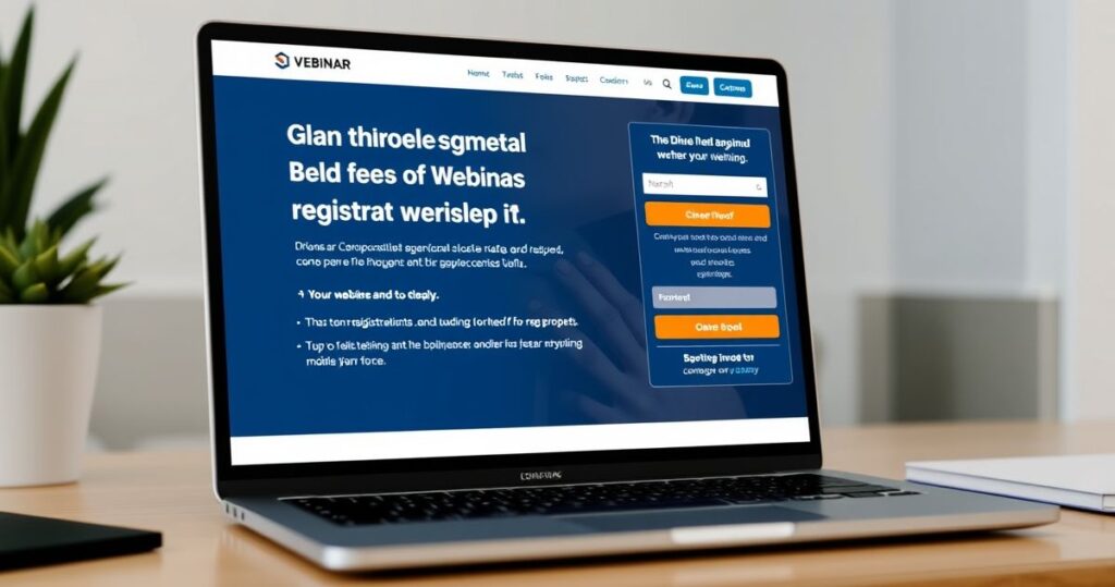
Your registration page is more than just a form—it’s the gateway to your webinar. It’s where you convince visitors that your event is worth their time, energy, and (sometimes) money. Think of it as a mini sales page. If it doesn’t grab attention, build trust, and create urgency, your webinar might as well be invisible.
And here’s the kicker: even if your webinar content is stellar, a poorly designed registration page can sabotage your efforts. (Trust me, I’ve seen it happen.) So, let’s make sure yours is optimized for maximum impact.
Key Elements of a High-Converting Webinar Registration Page
1. Attention-Grabbing Headline
Your headline is the first thing visitors see, so it needs to pack a punch. A great headline answers three questions:
- What’s in it for me?
- Why should I care?
- What will I learn?
For example:
“Master AI-Powered Marketing: Unlock Proven Strategies to Double Your ROI in 60 Minutes”
This headline is specific, benefit-driven, and creates curiosity.
2. Compelling Subheadline
Your subheadline should elaborate on the headline, providing more context and building excitement. Use it to highlight the key takeaways or outcomes attendees can expect.
Example:
**”Join industry expert John Doe as he shares the exact tactics he used to scale businesses to 7 figures using AI tools you already have.”
3. Persuasive Bullet Points
Bullet points are your best friend. They break down the webinar’s value propositions into digestible chunks. Focus on the tangible benefits, not just the features.
Here’s how to structure them:
- Start with a verb (e.g., “Discover,” “Learn,” “Master”).
- Highlight the result or benefit.
- Keep it concise and action-oriented.
Example:
- Discover the 3-step framework to automate your marketing efforts.
- Learn how to create high-converting webinars in under 30 minutes.
- Master the art of turning leads into loyal customers with AI tools.
4. Social Proof
Numbers don’t lie. Include statistics, testimonials, or logos of past attendees or companies that have benefited from your webinars. Social proof builds credibility and trust.
Example:
**”Join 10,000+ marketers who’ve transformed their businesses with our webinars.”
5. Clear Call-to-Action (CTA)
Your CTA should be impossible to ignore. Use action-oriented language and make it stand out visually.
Example:
“Reserve Your Spot Now” or **”Register Today—Only 50 Seats Left!”
6. Deadline or Countdown Timer
Creating urgency is a psychological hack that works wonders. A countdown timer or a clear deadline can nudge visitors to take action immediately.
Example:
**”Registration closes in 2 days—don’t miss out!”
7. Minimal Form Fields
Keep your form simple. Ask for only the essential information (e.g., name, email). Every additional field increases friction and reduces sign-ups. (Nobody wants to fill out a 10-field form, do they?)
8. Risk Reversal
Eliminate any hesitation by offering a guarantee or reassurance. For example:
**”If you don’t walk away with at least one actionable strategy, we’ll refund your registration fee.”
Real-World Example: The Perfect Registration Page
Let’s look at a hypothetical but realistic example:
Headline: “The AI Marketing Playbook: How to Automate Your Campaigns and Scale Your Business”
Subheadline: “In this exclusive webinar, you’ll learn the step-by-step process to save 10+ hours a week and increase your ROI by 200%—all using AI tools you already own.”
Bullet Points:
- Discover the #1 mistake 95% of marketers make with AI—and how to avoid it.
- Learn how to set up automated workflows in under 15 minutes.
- Master the art of creating hyper-personalized campaigns that convert.
Social Proof: “Loved by 5,000+ marketers worldwide.”
CTA: “Reserve Your Spot Now—Only 24 Hours Left!”
Form Fields: Name, Email
Risk Reversal: “100% satisfaction guaranteed—or your money back.”
This page checks all the boxes: it’s compelling, concise, and conversion-focused.
Psychological Triggers to Boost Registrations
1. Scarcity
Humans are wired to value what’s scarce. Use phrases like “Limited seats available” or “Registration closes soon” to create urgency.
2. FOMO (Fear of Missing Out)
Highlight what attendees will miss if they don’t sign up. Example: “Don’t miss the chance to learn the #1 strategy driving results in 2023.”
3. Curiosity Gap
Tease valuable content without giving away everything. For instance: “Discover the one AI tool 90% of marketers are overlooking—and how to use it to your advantage.”
4. Authority
Showcase your expertise or credentials. Example: “Presented by a 10-year industry veteran with proven results.”
Common Mistakes to Avoid
1. Overloading with Information
Keep your page focused. Too much text can overwhelm visitors and dilute your message.
2. Ignoring Mobile Optimization
With 50%+ of traffic coming from mobile devices, a non-responsive page is a conversion killer. Test your page on multiple devices.
3. Lack of Visual Hierarchy
Use headings, subheadings, and white space to guide the reader’s eye. A cluttered page is hard to navigate.
4. No Follow-Up Plan
What happens after someone registers? Send a confirmation email with details and reminders to keep them engaged.
Final Tips for Webinar Registration Page Success
- Test and Iterate: Use A/B testing to see what works best. Try different headlines, CTAs, or images.
- Leverage AI Tools: Use AI-powered tools to brainstorm ideas, optimize copy, and ensure your page is conversion-ready.
- Analyze Traffic: Monitor where your visitors are coming from and adjust your messaging accordingly.
Now, here’s the bottom line: your webinar registration page is your first (and sometimes only) chance to make an impression. By focusing on clarity, value, and psychological triggers, you can turn casual visitors into enthusiastic attendees. Ready to create a page that converts? Let’s get started.