Designing High-Converting Webinar Registration Pages
Designing High-Converting Webinar Registration Pages: The Ultimate Guide
In the world of digital marketing, your webinar registration page is the gateway to your event. It’s the first impression you make on potential attendees, and if it doesn’t captivate, persuade, and convert, your hard work planning the webinar goes to waste. So, how do you design a webinar registration page that doesn’t just look good but drives results? Let’s break it down.
Why Your Webinar Registration Page Matters
Think of your registration page as the front door to your webinar experience. It’s not just a form—it’s a sales pitch, a reassurance, and a call to action all rolled into one. A well-designed page can increase sign-ups by 30% or more, while a poorly executed one can send your bounce rates soaring. But here’s the kicker: it’s not just about aesthetics. It’s about understanding your audience’s psychology and leveraging tools that make the process seamless and irresistible.
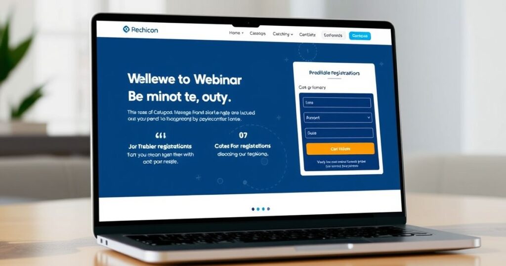
Key Components of a High-Converting Webinar Registration Page
Let’s get practical. What elements should your page include to maximize conversions? Here’s a breakdown:
-
A Compelling Headline
Your headline is your hook. It should immediately communicate the value of your webinar. For example, instead of “Join Our Webinar on Digital Marketing,” try “Unlock Proven Strategies to 3X Your Digital Marketing ROI in 90 Days.” See the difference? One is generic; the other promises specific results. -
A Clear Value Proposition
Why should someone invest their time in your webinar? Use bullet points to highlight the key takeaways, benefits, and outcomes. For instance:
- Discover 5 actionable strategies to scale your business.
- Access exclusive templates and resources.
- Learn from industry experts with 10+ years of experience.
-
Social Proof
Testimonials, logos of past clients, or attendee numbers can build trust. For example, “Join 5,000+ marketers who’ve seen results with our webinars.” -
A Strong Call-to-Action (CTA)
Your CTA should be clear, action-oriented, and urgent. Consider phrases like “Reserve Your Spot Now” or “Sign Up Before It’s Too Late.” -
Minimal Form Fields
Keep the form short and sweet. Ask for only what you need—name, email, maybe job title. Anything more can scare people off. -
Visual Appeal
Use high-quality images, videos, or animations to grab attention. A short teaser video explaining what attendees can expect can work wonders.
The Psychology Behind High-Converting Pages
Understanding the psychology behind what makes people click is crucial. Here are a few principles to keep in mind:
- FOMO (Fear of Missing Out): Add urgency with phrases like “Limited Seats Available” or “Registration Closes Soon.”
- Trust Signals: Use certifications, awards, or badges to establish credibility.
- Reciprocity: Offer a free bonus (e.g., a downloadable guide) for signing up.
- Simplicity: A cluttered page is overwhelming. Stick to clean designs with ample white space.
Real-World Example: How XYZ Company Boosted Sign-Ups by 45%
Let’s look at a case study. XYZ Company was struggling with low webinar sign-up rates (around 15%). After revamping their registration page with these strategies, they saw a 45% increase in conversions. Their changes included:
- A more compelling headline, “Master Email Marketing: Grow Your List and Revenue in 30 Days.”
- A video testimonial from a past attendee.
- A countdown timer emphasizing urgency.
AI-Powered Tools to Supercharge Your Registration Page
Now, here’s where it gets interesting. AI-powered tools can take your webinar registration page to the next level. Here’s how:
-
Slide Outline Creator
Use AI to design slides that resonate with your audience, ensuring your webinar content aligns with the promises on your registration page. -
Webinar Offer Builder
Struggling to articulate your offer? This tool helps structure pricing, stack value, and position your offer for maximum appeal. -
High-Value Bonus Brainstormer
Generate irresistible bonus ideas that make signing up a no-brainer. -
Risk-Reversal/Guarantee Generator
Create guarantees that reduce perceived risk. For example, “If you don’t find value in this webinar, we’ll refund your money.”
Common Mistakes to Avoid
Let’s be honest: even seasoned marketers make mistakes. Here are a few to watch out for:
- Overcomplicating the Design: Too many options or visuals can distract from your CTA.
- Ignoring Mobile Optimization: 60% of users access web content on mobile devices. Ensure your page is mobile-friendly.
- Failing to Test: Always A/B test headlines, CTAs, and designs to see what works best.
Pro Tips for Ongoing Success
-
Leverage Retargeting Ads
Not everyone will sign up on their first visit. Use retargeting ads to bring them back. -
Follow Up with Email Sequences
Send reminders leading up to the event to keep attendees engaged. -
Analyze Data Regularly
Use analytics tools to track performance and identify areas for improvement.
Final Thoughts
Designing a high-converting webinar registration page is both an art and a science. It requires a deep understanding of your audience, a clear value proposition, and the right tools to streamline the process. Whether you’re a seasoned marketer or just starting out, these strategies and AI-powered tools can help you create pages that not only convert but also set the stage for a successful webinar.
So, what’s your next move? Will you revamp your registration page today?