How to interpret webinar analytics for actionable insights.

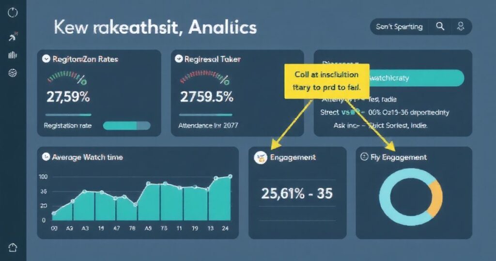
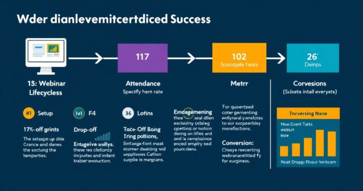
Are your webinars underperforming, or are you unsure how to measure their success? Here’s the truth: hosting a webinar is just the first step. The real magic happens when you dive into the data. Webinar analytics provide a goldmine of insights that can transform your strategy, boost engagement, and skyrocket conversions. But how do you interpret this data effectively? Let’s break it down step by step. ### Understanding the Basics: What Webinar Analytics Tell You Webinar analytics track every aspect of your event, from attendee behavior to engagement levels and conversion rates. Think of it as a behind-the-scenes look at how your audience interacts with your content. Metrics like attendance rate, drop-off points, and Q&A participation can reveal what’s working—and what’s not. But here’s the catch: not all metrics are created equal. For example, knowing that 500 people registered is great, but if only 200 showed up, you’ve got a problem. Similarly, high engagement during the first 10 minutes that drops off sharply could indicate a need for better content pacing. The key is to focus on the metrics that matter most to your goals. ### Key Metrics to Watch (and Why They Matter) Let’s get specific. Here are the most critical metrics to analyze and what they can tell you: 1. Registration Rate – What it measures: How many people signed up for your webinar. – Why it matters: A low registration rate could indicate issues with your promotion strategy or webinar topic relevance. – Actionable insight: Test different headlines, landing page designs, and email sequences to boost registrations. 2. Attendance Rate – What it measures: The percentage of registrants who actually attended. – Why it matters: A low attendance rate might suggest poor timing, lack of reminders, or unappealing content. – Actionable insight: Send personalized reminders, offer early-access incentives, or reschedule to a more convenient time. 3. Average Watch Time – What it measures: How long attendees stayed engaged. – Why it matters: Short watch times often signal disinterest or content fatigue. – Actionable insight: Tighten your script, add interactive elements, or break content into shorter segments. 4. Engagement Metrics – What it measures: Poll responses, Q&A participation, and chat activity. – Why it matters: High engagement indicates audience interest and interaction. – Actionable insight: Use more polls, encourage questions, or gamify the experience. 5. Conversion Rate – What it measures: The percentage of attendees who took the desired action (e.g., purchased a product, signed up for a trial). – Why it matters: This is the ultimate measure of your webinar’s success. – Actionable insight: Test different CTAs, optimize your offer, or add scarcity elements. Now, here’s where it gets interesting: these metrics don’t exist in isolation. Combining them can reveal deeper insights. For instance, if you have high attendance but low engagement, it’s time to rethink your content delivery. ### Tools to Analyze Webinar Data Interpreting analytics requires the right tools. Most webinar platforms (like Zoom, Webex, or Demio) offer built-in analytics dashboards. Here’s how to make the most of them: 1. Dive into Heatmaps: Some tools show which parts of your webinar were most and least engaging. Use this to identify content gaps. 2. Track Poll Responses: Analyzze which questions sparked the most interaction. 3. Review Chat Transcripts: Look for recurring themes or questions that indicate audience interests or pain points. Pro Tip: Pair your platform’s analytics with tools like Google Analytics or HubSpot to track post-webinar behavior, such as website visits or email sign-ups. ### Real-World Example: How Data Turned a Failing Webinar Around Let’s be honest about this: not every webinar is a hit. I once worked with a client whose webinar had a 40% attendance rate and a 10% conversion rate—numbers that made us cringe. But instead of scrapping the whole thing, we dug into the data. What did we find? Attendees were dropping off after the 15-minute mark, and the Q&A section was virtually silent. We adjusted the content to make the first 10 minutes more engaging and added interactive polls throughout. The result? The next webinar saw a 70% attendance rate and a 25% conversion rate. ### Common Pitfalls to Avoid While analyzing webinar data, it’s easy to fall into these traps: 1. Focusing on Vanity Metrics: High registration numbers look great, but they don’t mean much if no one shows up or converts. 2. Ignoring Context: A sudden drop in engagement might not be due to poor content—it could be a technical issue or a scheduling conflict. 3. Overcomplicating the Analysis: Don’t get bogged down by every metric. Focus on the ones that align with your goals. ### Turning Insights into Action The real value of webinar analytics lies in what you do with them. Here’s a simple framework to turn insights into action: 1. Identify the Problem: Use the data to pinpoint where things went wrong (or right). 2. Test Solutions: Experiment with different approaches, such as adjusting your content or changing the timing. 3. Measure Results: Track the impact of your changes to see what works best. 4. Iterate: Use what you’ve learned to continuously improve your webinars. Bonus Tip: Create a post-webinar report to document your findings and share them with your team. This ensures everyone is aligned and learning from the data. ### The Bigger Picture: Why Analytics Matter Webinar analytics aren’t just about numbers—they’re about understanding your audience. By analyzing their behavior, you can create content that resonates, build stronger relationships, and drive meaningful results. After all, isn’t that what marketing is all about? So, the next time you host a webinar, don’t just close the session and move on. Take the time to dive into the data. Trust me, the insights you uncover will be worth it.


