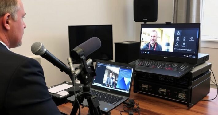
Webinar Registration Page Best Practices

Webinar Registration Page Best Practices: The Ultimate Guide to Boosting Conversions
Your webinar registration page is the gateway to your event—and your sales funnel. Whether you’re hosting a product demo, a thought leadership session, or a training workshop, it’s the first impression that either compels people to sign up or sends them clicking away. So, how do you create a registration page that not only attracts eyeballs but also converts them into eager attendees? Let’s dive into the best practices that’ll turn your webinar page into a lead-generating powerhouse.
Why Your Webinar Registration Page Matters More Than You Think
Let’s be honest: most marketers underestimate the power of a well-crafted registration page. They focus on the webinar content (which is important, don’t get me wrong) but neglect the page that’s supposed to sell the webinar. Think of it this way: your webinar is the steak, and your registration page is the sizzle. No one’s buying if they don’t hear the sizzle first.
Your registration page has one job—to convince visitors to take action. Whether it’s signing up, sharing their email, or even opting into your email list, every element on the page plays a role in that decision. Let’s break down the anatomy of a high-converting webinar registration page.
1. Craft a Compelling Headline That Grabs Attention
Your headline is the first thing visitors see, and you’ve got about 3 seconds to make an impact. A vague or generic headline like “Join Our Webinar” won’t cut it. Instead, focus on the benefit your audience will get from attending.
Example of a Boring Headline:
“Webinar: Learn About AI Marketing”
Example of a Compelling Headline:
“Double Your Leads in 30 Days: AI Marketing Strategies That Actually Work”
See the difference? The second headline immediately communicates value and creates curiosity.
2. Write Benefit-Driven Copy That Speaks to Your Audience
Once you’ve hooked them with the headline, your copy needs to keep them engaged. Don’t just list features—tell them why they should care. Here’s where you address their pain points and position your webinar as the solution.
Pro Tip: Use storytelling techniques. For instance, instead of saying, “We’ll teach you how to optimize your sales funnel,” try this:
“Imagine closing 20% more deals without working longer hours. In this webinar, we’ll show you the exact steps we used to help our clients achieve just that.”
3. Use High-Quality Visuals to Build Trust
Humans are visual creatures, and your webinar registration page should reflect that. Use high-quality images or videos that align with your brand and message. A professional-looking design not only builds trust but also sets the tone for your event.
Bonus Tip: Consider adding a short teaser video (1-2 minutes max) where the host introduces themselves and gives a sneak peek of what attendees can expect. It’s a fantastic way to humanize your page and build rapport.
4. Simplify the Form: Less Is More
Here’s where many marketers trip up. They ask for too much information upfront, which can scare people away. Remember, your goal is to get them to register—you can gather more details later.
Best Practices for Registration Forms:
- Ask for the essentials only (name and email)
- Use smart defaults (e.g., pre-select time zones if relevant)
- Add a privacy statement to reassure users
5. Add Social Proof to Build Credibility
Want to ease doubts and build trust? Add testimonials, logos of past clients, or statistics that showcase your expertise.
Example:
“Over 10,000 marketers have attended our webinars, with 92% reporting measurable results.”
6. Create a Clear Call-to-Action (CTA)
Your CTA is the final nudge that turns interest into action. Use action-oriented language and make it stand out visually.
Examples of Effective CTAs:
- “Reserve My Spot Now (It’s Free!)”
- “Join the Waitlist for Exclusive Early Access”
7. Optimize for Mobile Users
With more than half of web traffic coming from mobile devices, your registration page must be mobile-friendly. Test your page on different devices to ensure it loads quickly, looks great, and is easy to navigate.
8. Use Urgency and Scarcity (But Don’t Overdo It)
Adding a sense of urgency or scarcity can motivate people to act faster. For example:
- “Only 50 Spots Left!”
- “Register by Friday to Receive a Free Bonus Guide”
Just be honest—nothing kills trust faster than fake deadlines.
Real-World Example: How Company X Tripled Their Webinar Sign-Ups
Company X (let’s call them that) was struggling to get more than 100 sign-ups for their monthly webinars. We revamped their registration page with a compelling headline, a short teaser video, and a simplified form. We also added social proof by highlighting past attendees’ success stories. The result? They tripled their sign-ups in just one month.
Common Mistakes to Avoid
Even with the best intentions, it’s easy to make mistakes. Here are a few common pitfalls:
- Overloading the page with too much text: Keep it concise and scannable.
- Using jargon: Speak your audience’s language, not your industry’s.
- Forgetting to test: Always A/B test different elements to see what works best.
Final Thoughts: Your Registration Page Is Just the Beginning
Creating a high-converting webinar registration page is just the first step. Once you’ve got those sign-ups, the real work begins—delivering value, nurturing leads, and turning attendees into customers. But with these best practices, you’ll set yourself up for success from the very beginning.
Now, here’s a question to leave you with: What’s one thing you can improve on your current registration page today?


